
StoryGraph
UX / UI Design
Role
1 day, Spring 2026
Duration
Tools
Figma, Claude
StoryGraph is a mobile app for tracking reading, often contrasted with the foundational GoodReads or the newer Fable. StoryGraph’s users enjoy its detailed approach to data visualization, but struggle with the UI’s overlapping pop-ups and maximalist informational approach.
I have performed a few small, high-impact revisions to StoryGraph’s interface and basic functions. An update to its main menu, refresh of its edit feature for current books, and facelift of its challenges page allow for users to continue to receive the wealth of insights on their reading they so love while being less hindered by the in-app interactions.
Context
Problem
I begin by asserting that, overall, StoryGraph is a wonderful app. It has many excellent features and benefits those who wish to diligently track their paperback and audiobook consumption in order to reflect on their literary diet.
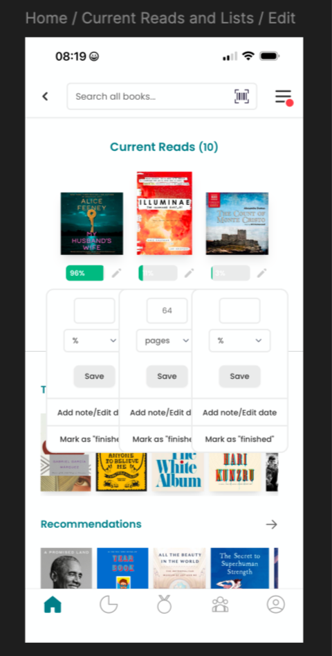
That said, there are several glaring flaws in the interactions the app invites for the user. Namely, updating a current read opens a dialogue that overlays on top of the existing interface in such a way that prevents easy interaction. Additional dialogues may be opened and the previous ones do not automatically close. The layout of current reads in a horizontal fashion limits the details associated with each one such that they are effectively unusable to the customer.
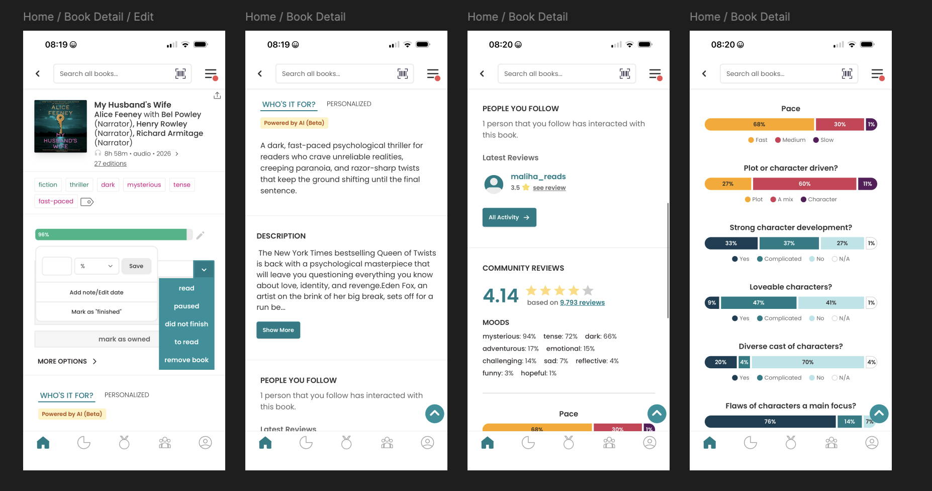
The latest update to StoryGraph brought some welcome revisions to the visualization of the key questions asked in the book review process, showing them as percentages of a bar graph. While this provides some improvement, there is still much to be done about the wordy description section and the AI description (notably in beta) to make these useful to the customer. Instead of a long scroll function, I recommend breaking the information into distinct cards and including a personal reading journey to visualize the notes and timeline of reading a particular book.
Process
PERFORMANCE
The loudest complaint, by far, is performance. Since late 2024, iOS users have reported load times ranging from 30 seconds to several minutes for basic navigation and blank home screens on open have been reported persistently for months, leading some users to abandon the app for the website. This isn’t something that I can fix from the design side without a peek behind the engineering curtain to understand what is causing the delay.
NAVIGATION
Navigation, however, is a close second complaint. Certain pages require several unintuitive clickthroughs and the interface feels confusing to newer users. The social layer draws consistent criticism: users cannot comment on or like reviews, and there are no API tie-ins to other social platforms, which makes friend discovery frustrating.
DESCRIPTIONS
Lastly, the AI-generated book previews are polarizing — some users actively dislike AI-generated descriptions appearing above publisher copy. Many of these issues are emblematic signal of limited engineering bandwidth. Understandable from such a small team!
Focus
After reviewing my own usage — I don’t particularly hope to see what strangers are reading or care about the social media aspect of the app — I decided to focus my efforts on the navigation issues and touch a bit on the AI-review and personal review and data portion of the app experience.
Figma Wireframing
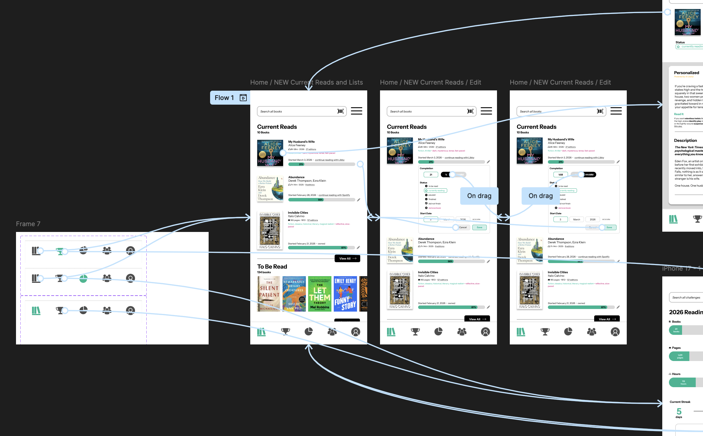
With research done, it’s time to open up Figma and start to import screenshots of the existing app to create wireframes. Next, I drafted my updates to the UI as I was thinking about how I wanted the UX to move. My design emphasizes removing the overlaps, creating higher visibility for important details, and making interactions smoother for the user in small details.
Research
StoryGraph has overall received positive reviews, which supports my personal experience as a user of the app. I know the team is small (3 people with only one founding developer) so I understand there are probably a lot of things on their fix-it list — and perhaps I’ve even hit a few of them.
Product
Editing Current Reads
My version creates a dropdown box that appears when the pencil icon to edit is selected. Users may toggle easily between completion percentage and hours/minutes listened. Status can be updated (and now includes icons) in the same place that start date may be revised.
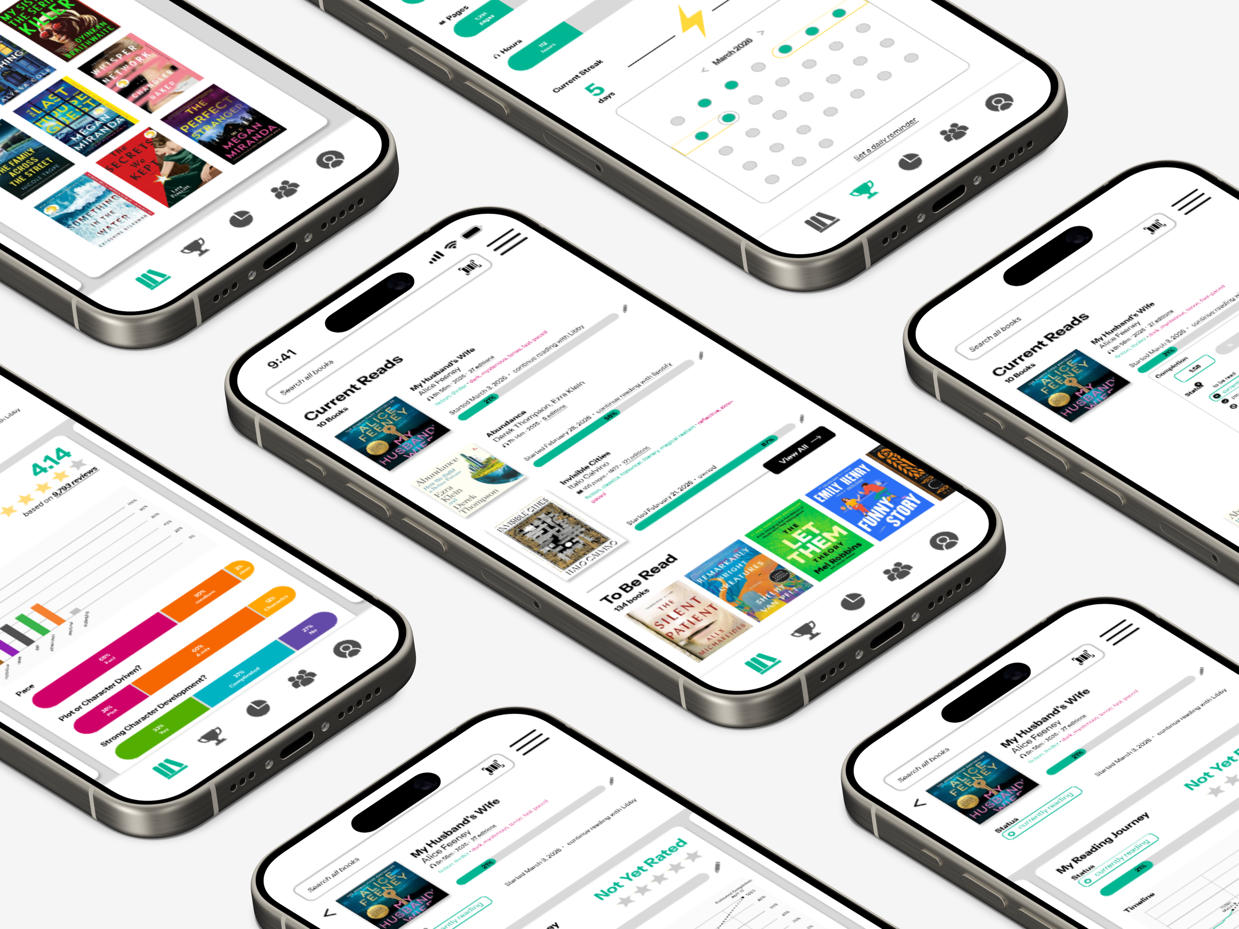
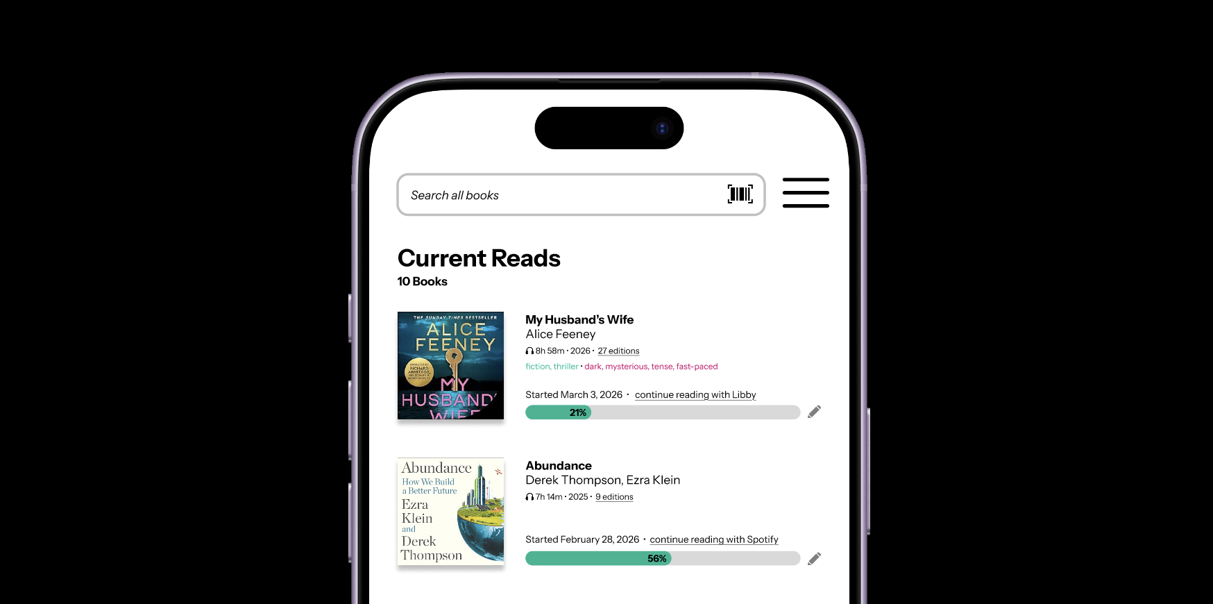
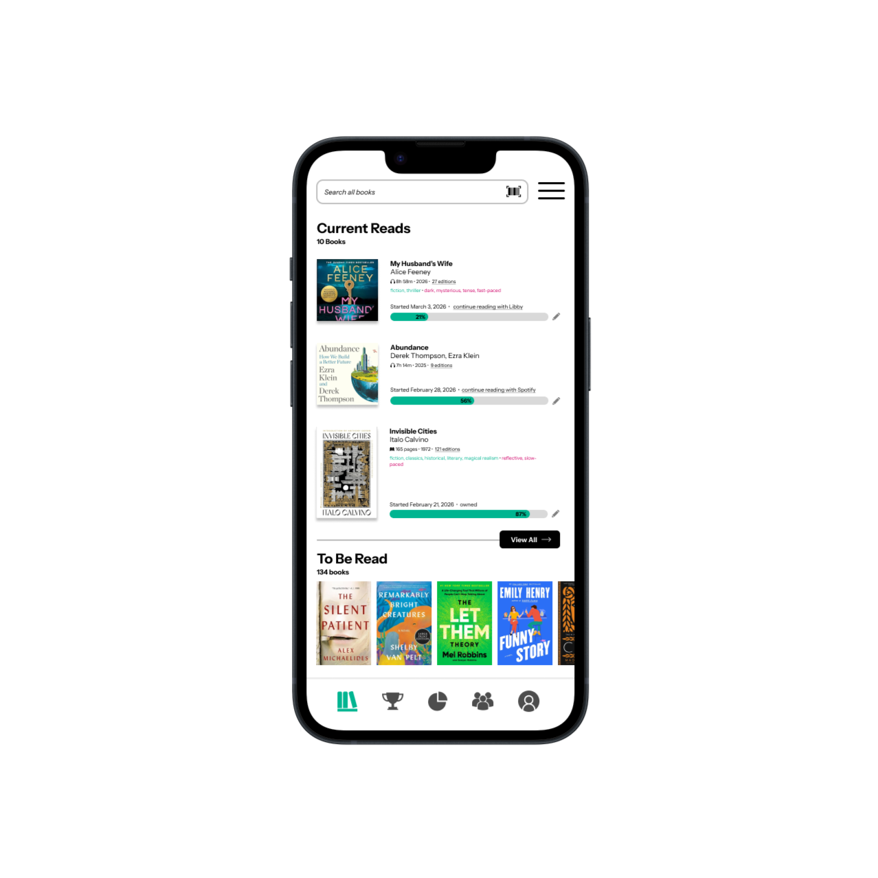
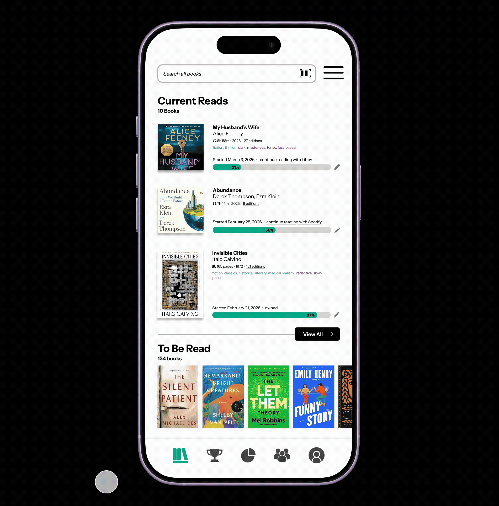
Showing Current Reads
Removing the horizontal shelf allows for greater detail to be displayed. If the purpose of the home page is to show a quick view of the most recently interacted-with current reads, a horizontal visual shelf provides too little information to be meaningful for the user. A detailed view with editing capabilities is more useful. The view all button remains as I suggest limiting the current reads view to 3 initial books or audiobooks.
Main Menu
I have updated the main menu to show the StoryGraph logo in place of the home icon, suggesting that this is where users may click to return to the home page of the app which is their digital shelf. Additionally, I have revised the order of the remaining icons, swapping the challenges (now a trophy instead of a medal as the circle was too similar to the pie chart) and the statistics (a pie chart still) since the main use case for most users visiting StoryGraph is to review the data visualizations of their reading.
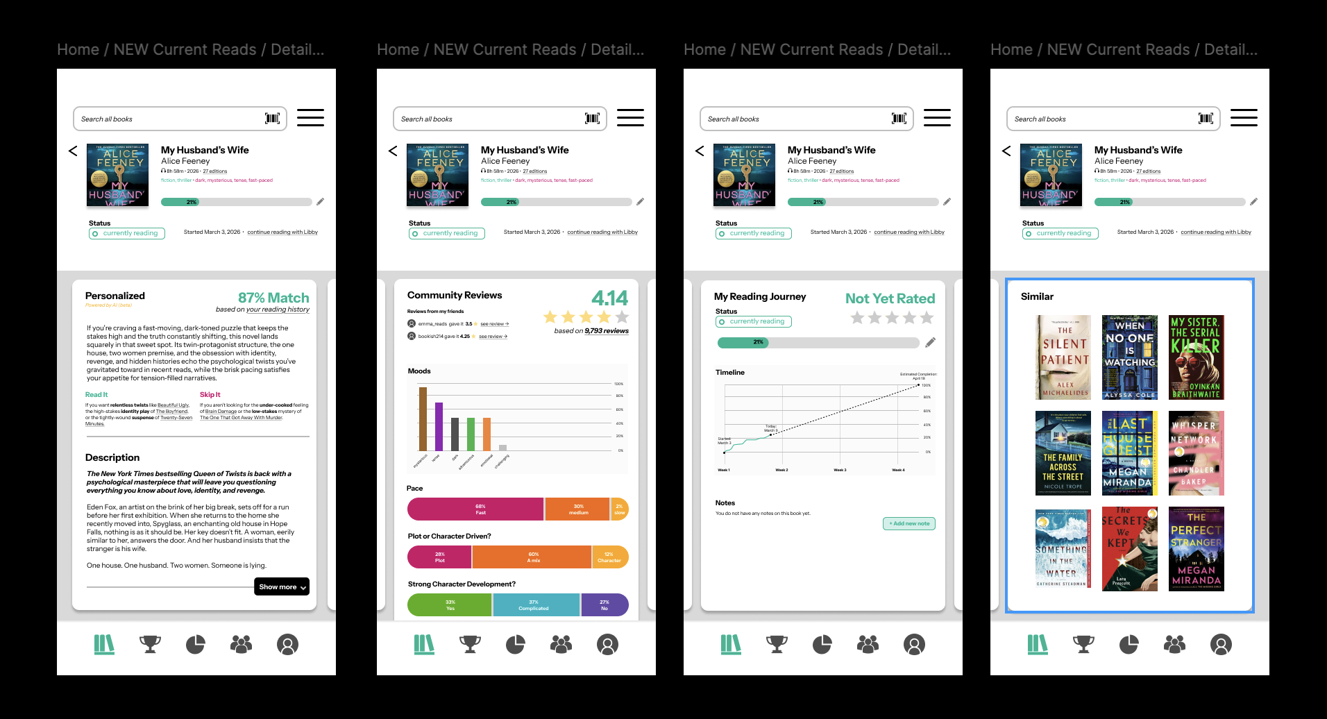
Detail View
I updated the detail view of a single book to involved horizontal scrolling cards (each of which are then vertically scrollable if extended) separating the subcomponents of the details for a single book into four sections:
Personalized and Publisher’s Descriptions
This was previously formatted in a way that was polarizing and difficult to navigate.
Community Reviews
These have been simplified so the information no longer requires a key alongside the visualization
My Reading Journey
This is a new addition from me, based on my enjoyment of the Libby reading app’s estimated reading time. I figured that users of StoryGraph would appreciate a projection of reading timeline next to their reading notes and personal book review.
Similar Books
While there is a similar books feature in StoryGraph, it is hidden under a “More Options” tab and has low visibility. Reading recommendations is one of the most key opportunities for leveraging user data across platforms and should be utilized here in a visual format.
Results
Figma Prototype
A jaunt through my Figma prototype shows the new expanded dropdown for editing the current reads.
Then, I briefly take you through the detail view of a book, which shows new detail cards:
Description, including an updated version of the personalized AI description
Community Reviews, which displays Mood in a similar visualization to the statistics section for year-to-date books.
My Reading Journey, demonstrating the trajectory of someone’s reading journey on a timeline in addition to any notes taken on the book over the course of reading.
Similar, allowing readers to quickly navigate to similar titles like in Fable.
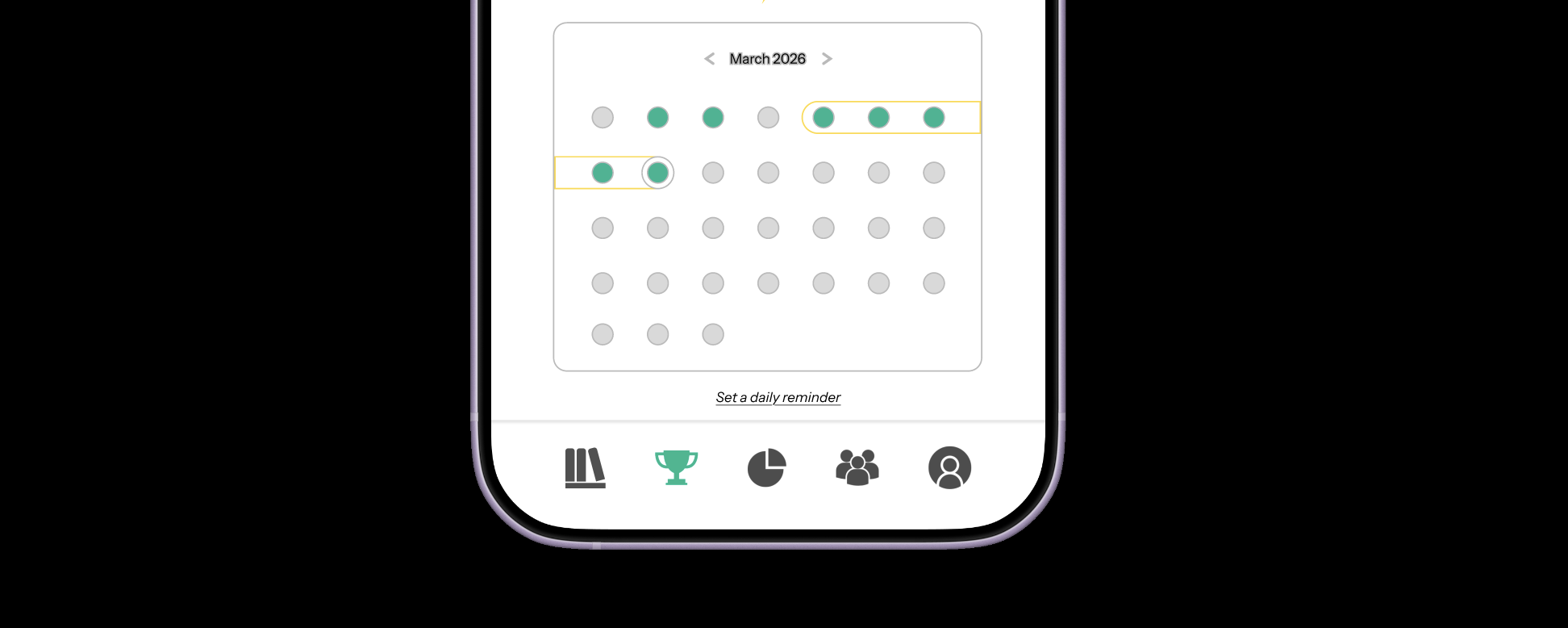
I end with a quick view of the new layout of the Challenges page, showing a reading streak and a calendar of successful reading days.